The "Tree" element offers the possibility to display entries as a tree structure, to browse them and to offer a selection of entries by the user.
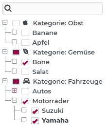
In order for such a tree structure to be created from dynamic data, defined conditions are placed on the structure of the data source. This means above all under which data field the subnodes of an entry are to be read. Furthermore, data fields for the label or an icon per entry can also be defined in each case. The application example shown above is based on a "StaticValuesService" with a "FixedValuesConverter" as the data source for the tree nodes:
Example:
[
    {
        "key": "1",
        "label": "Kategorie: Obst",
        "icon": "fa://fa-apple",
        "items": [
            {
                "key": "11",
                "label": "Banane"
            },
            {
                "key": "12",
                "label": "Apfel"
            }
        ]
    },
    {
        "key": "2",
        "label": "Kategorie: Gemüse",
        "icon": "fa://fa-envira",
        "items": [
            {
                "key": "21",
                "label": "Bone"
            },
            {
                "key": "22",
                "label": "Salat"
            }
        ]
    },
    {
        "key": "3",
        "label": "Kategorie: Fahrzeuge",
        "icon": "fa://fa-car",
        "items": [
            {
                "key": "31",
                "label": "Autos",
                "items": [
                    {
                        "key": "311",
                        "label": "Ford Mustang"
                    },
                    {
                        "key": "312",
                        "label": "Audi A4"
                    }
                ]
            },
            {
                "key": "32",
                "label": "Motorräder",
                "items": [
                    {
                        "key": "321",
                        "label": "Suzuki"
                    },
                    {
                        "key": "322",
                        "label": "Yamaha"
                    }
                ]
            }
        ]
    }
]
How the information of the data structure is to be interpreted is defined via the property editor:
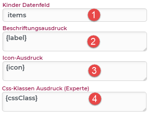
(1) Children data field: This defines under which data field the subnodes of a node are to be read. Here in the example "items" (compare the data structure example).
(2) Label expression: The labeling of the nodes (2) [category "Entries and Service"] can be defined with the help of an expression (All expressions and functions of the PARSE are available). In this example, only the content of the "label" field is used (compare the data structure example).
(3) Icon expression: Analogous to the label, this can be optionally stored as an PARSE. In this example marked as "icon" (compare the data structure example).
(4) Css classes expression: Styling experts can also apply Css classes to individual tree entries. Multiple class names are separated by spaces. All functions of the PARSE are available here as well. The Css classes themselves can be defined in the "Style Designer module" (recommended for experts only!). Example: "classname1 classname2 classname3".
Events (Behavior)
Event | Description |
|---|---|
Changed | Triggered when the set of checked elements changes. The selected elements are passed to the behavior (see also Data model). |
Selected items | Is triggered as soon as an item in the tree is selected (e.g. click on a tree node). Caution: Not to be confused with "checked". The selected item is passed as an object to the configured behavior. If the "Allow multiple selection" option is active, the first entry in the selection list is always passed here. |
Selected items | This is triggered when the "Allow multiple selection" option is active and always returns a list of items, even if only one has been selected. The list of selected items is passed to the configured behavior. |
Double click item | Triggered as soon as a tree node is double-clicked. The clicked item is passed to the configured behavior. |
Search term changed | Triggered as soon as the search term is changed in the search field of the tree. The new search term is passed to the behavior. |
Data model
Under the umbrella of the tree component is the data model of a Multiselect combobox (see also chapter List elements for details on services). The tree nodes are to be understood as an entry pool and "checked" nodes as the "values" of the tree. In order to be able to use the data model of the tree in the first place, the property Items checkable must be activated via the property editor.
Another useful setting is the option Only leaves as values. This determines whether nodes, which in turn have subnodes (branches) appear as values of the element data or only items without subnodes (leaves).
For example, the image at the top shown initially would have the following element data (the data field of the tree).
Data for the tree shown above:
{
    "tree": [
        "322",
        "321",
        "21"
    ]
}
Element type table
The tree component also offers another display type via the "Common" property rubric: "Table". This display type allows columns to be added in order to be able to display further information per entry, formatted accordingly. How to configure such a tree table is explained in the chapter Tree element type: Table.