With the help of the dashboard designer, user-specific forms with evaluation charts can be created, which can receive their data directly from the Lobster Data Platform/Orchestration system.
The central tool of the dashboard designer is the Form designer, which is also used for creating business object forms.
The following descriptions are distinguished:
Dashboard – an object that appears in the 'Dashboards' overview.
Dashboard element – an element that can be dragged onto the dashboard form using the form designer.
CAUTION The Lobster_pro dashboard is a pure visualization layer for statistical data. The number of data sets to be processed therefore has natural limits. Where this limit lies depends on the processing power of the client system and must be determined by testing. Loading and aggregation of data in the dashboard configuration is performed exclusively by the client (browser), which can significantly affect the performance of the application, depending on the amount of data. In such cases, it is recommended to pre-summarize the data externally (e.g. via a data mining tool or by incrementally exporting the relevant data to an external database table) and then load it e.g. via Call profile (Lobster_data) for processing in the Lobster_pro dashboard.
Technical principle
The dashboard consists of a chain of three elements:
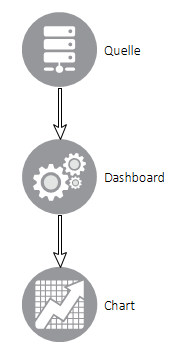
Via a data source, the data is read from the Lobster Data Platform/Orchestration system and delivered to the dashboard element (the 'Dashboard configuration' form element). The dashboard element forms an OLAP cube from the data (see Wiki: OLAP cube), which is provided to the chart for visualization purposes.
In a dashboard, there must be at least one data source, one dashboard item, and one chart item. Each of these components can occur more than once, e.g. within a dashboard, two dashboard elements can access a data source, or two chart elements can access a dashboard element.
The data is provided in a behavior via the action 'Set shared Data Provider', in which a Data provider ID is defined as the unique name of this data set.
Configure source and dashboards
 A data source makes its search result available to the existing dashboard elements via the 'Set Shared Data Provider' action.
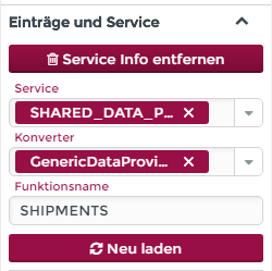 The service info of the dashboard element is configured so that the 'SHARED_DATA_PROVIDER' service and the 'GenericDataProviderConverter' are selected.
The function name must contain the data provider ID of the data source whose data is to be accessed.
Configure connection between dashboard and charts
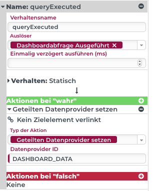 A dashboard element in turn makes the prepared data available to the existing charts in a behaviour of the 'Static' type via the 'Set Shared Data Provider' action. The trigger for the behaviour is 'Dashboard query executed'.
In the action, a unique data provider ID is defined again, which must be unique. The ID must now be different from the one used by the data source.
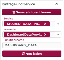
The service info of the charts is configured so that the 'SHARED_DATA_PROVIDER' service and the 'DashboardDataProviderConverter' are selected. IMPORTANT this is not the same converter as for the dashboard.
In the function name you have to enter the data provider ID of the dashboard element whose data you want to access.
IMPORTANT The subchapter Dashboard configuration shows the configuration of a dashboard in detail step by step.
Dashboard overview
The menu item 'Dashboard' (Administration – Configuration) takes you to the overview page of the dashboards visible to the logged-in user.
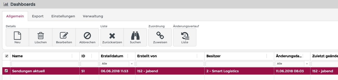
The ribbon buttons of the overview page have the following function:
Details
New: Opens the dashboard input form for creating a new dashboard.
Delete: The selected dashboard can be deleted. The button is activated only when an entry of the dashboard list is selected.
Edit: Open the dashboard capture screen and load the selected dashboard to edit it. The button is enabled only when an entry of the dashboard list is selected.
Cancel: The selection in the dashboard list will be cancelled. The button is enabled only when an entry of the dashboard list is selected.
List
Association
Assign: By applying existing Association criteria, a dashboard can be unlocked for specific user groups. The button is enabled only when an entry of the dashboard list is selected.
Change history
List: A list of all versions ever saved by a dashboard can be displayed. Any version can be reactivated. This is useful in case you accidentally deleted something from the dashboard or the last changes should be undone. The button is enabled only when an item of the dashboard list is selected.
Dashboard editor
A dashboard editor is a Portals which has been extended with the licensed dashboard components. The ribbon bar controls the functions, which are divided into four categories:
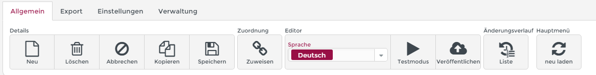
Details
New: The dashboard input form is completely cleared for the creation of a new dashboard. If changes to an already loaded dashboard are not saved at the moment of clicking, a security query is made.
Delete: The dashboard that is currently open is deleted. A security query is issued. The button is only activated if the dashboard currently being edited has already been saved.
Cancel: The dashboard that is currently open will be canceled and the dashboard input form will be cleared. If changes to an already loaded dashboard are not saved at the moment of clicking, a confirmation prompt will be displayed.
Copy: The dashboard that is currently open will be closed. A copy is created, which is not saved automatically. Therefore, a copy is created from the first manual save by the user.
Save: The dashboard that is currently open will be saved. The dashboard remains open and editing can be continued.
Association
Assign: By applying existing Association criteria, the dashboard can be enabled for specific user groups.
Editor
Language: Here you can switch the language of the localizable labels and texts. For example, if the language is set to English and such a text is edited in the editor, then this will only happen in the context of this particular language. However, this has no effect on the entries in the system's localization. The changes therefore apply exclusively to this form.
Test mode: Clicking this button switches the form to test mode. The activated test mode can be recognized by the fact that the button symbol changes from 'Play' (filled arrowhead to the right) to 'Stop' (filled square). In test mode, the dashboard can be run with the current changes without being saved beforehand.
CAUTION In test mode, the dashboard can be run with the current changes without being saved beforehand.
Publish: To make saved changes valid for dashboard users, the dashboard must be published using this button. A green success message displays that publication that has taken place. If the dashboard has not been previously saved after the last changes, it will be automatically saved before publishing. This can be recognized by a double green success message.
Change history
List: A list of all versions ever saved by a dashboard can be displayed. Any version can be reactivated. This is useful in case you accidentally deleted something from the dashboard or the last changes led nowhere and should be undone. The button is enabled only when an item of the dashboard list is selected.
Main menu
Reload: If a dashboard is to be displayed in the main menu or opened via an otherwise configurable action, the main menu must be reloaded via this button in order to become visible in the user's current session. Please note: For the reload to work, the dashboard must have been previously published and there must be an association criterion that entitles the currently logged in user to see the created dashboard.
'Dashboard' tab
The following parameters are set on the Dashboard tab:
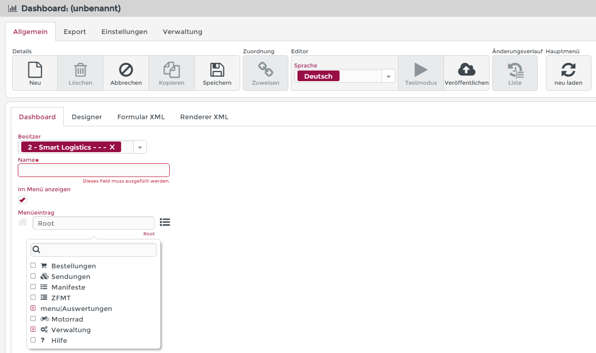
Dashboard: Name
The name can be freely chosen. However, it must be unique within the system.The name can be localized later via Localization. In localization, the entry for the resource name 'Dashboard$<NAME>' in the resource bundle 'scm.dashboard' must be edited.
Flag: Show in menu
The checkmark must be activated if the dashboard is to be accessed via the main menu.
Menu item
If the menu checkmark is set, the folder in which the menu entry for the dashboard should appear can be selected here.
A selection list of existing menu items can be opened via the hamburger button (on the right).
A new menu folder can be created by entering a completely new name in the text field, or by changing the entry created by selecting a menu folder in the text field. Subdirectories can be named by a slash (analogous to a file path in most operating systems).
'Designer' tab
This tab shows a Form designer. The operation as well as the buttons and components of the editor are described on the linked page.
'Form XML' tab
The XML structure output here is primarily used to analyze the generated Form XML format and can further be used to copy the entire dashboard into another Lobster Data Platform/Orchestration system. Details about this are described on the Form designer page.
'Renderer XML' tab
The XML structure output here corresponds to the structure that has been published and that a user loads when using the form. Details about this are described on the Form designer page.
See subchapter for more details
Examples of use for dashboards
2 dimensional OLAP cube with tuple search
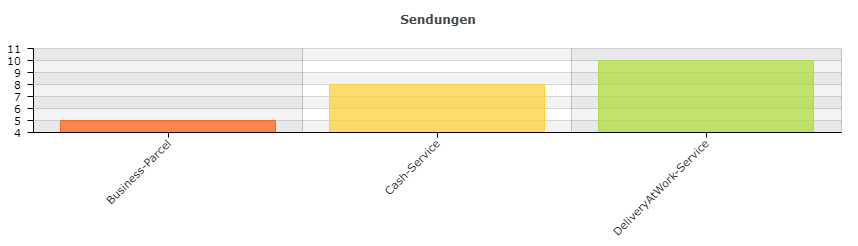
For this example, it is assumed that there are multiple shipments with different service types.
The objective is to display the number of shipments for each service type in a bar chart.
Desired result:
Step 1: Insert and configure data source tuple search
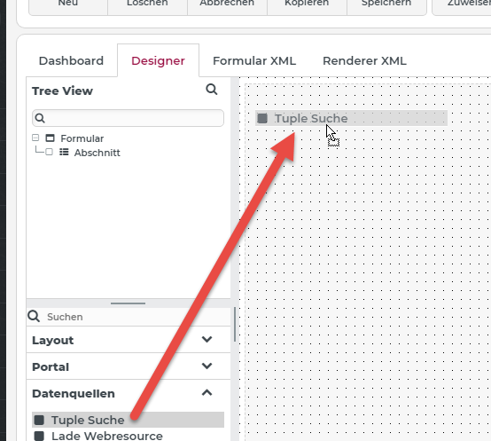
The 'Tuple search' data source is inserted into the form via drag and drop.
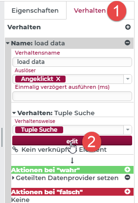
For configuration, select the element, switch to the Behavior (1) tab and click on edit (2).
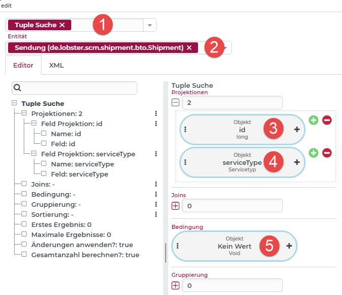
The dialog for configuring the tuple search opens (see also Tuple search (Form designer)). Tuple search (1) must be set as the search type. The searched entity in this case is a Shipment (2). For the id (3) of the shipment and for the Service type (4), one field projection each is defined. Since we are searching for all existing shipments in this simple example, we do not need to specify Condition (5).
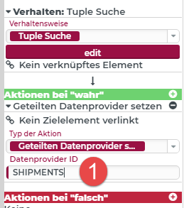
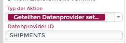
Next, the shared data provider must be set, through which the 'Dashboard configuration' element can access the data of the search.
NOTE If nothing is specified for (1), then the ID of the element (the tuple search) is automatically used as the Data provider ID. In our example, 'SHIPMENTS' is entered here.
Step 2: Insert and configure 'Empty dashboard'
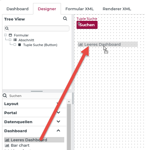 The 'Dashboard configuration' element is inserted into the form via drag & drop.
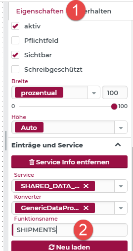
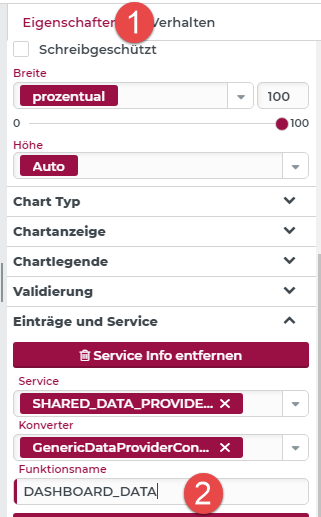
In the Properties (1) tab, the data provider ID of the data source must be entered as the Function name (2). Here 'SHIPMENTS'.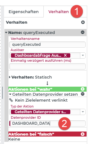 In the Behavior (1) tab, any name is entered as the Data provider ID, in this case 'DASHBOARD_DATA' (2). The bar chart element can then access the dashboard element's data via this shared data provider.
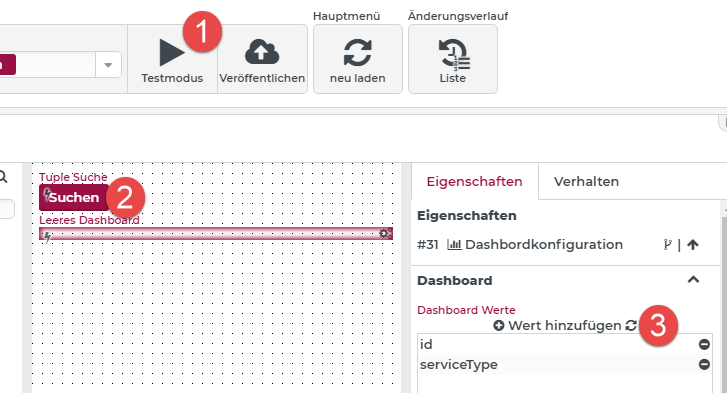
To configure the dashboard values you can switch to Test mode (1), then run the Tuple search (2), exit test mode again and then click (3). Now the available values from the tuple search are listed automatically.
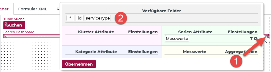
Clicking on (1) opens the dialog for configuring the OLAP cube to be created. The available fields (2) are now displayed here.
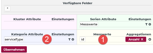
By drag & drop the available fields can be set as Measures (1) (here with the number creation of the id for the number of shipments) and as Category attributes (2) 'serviceType'.
Step 3: Insert and configure bar chart
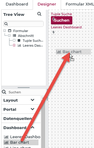
The 'Bar chart' element is inserted into the form via drag & drop.
In the Properties (1) tab, the data provider ID of the 'Dashboard configuration' must be entered as the Function name (2). Here 'DASHBOARD_DATA'.
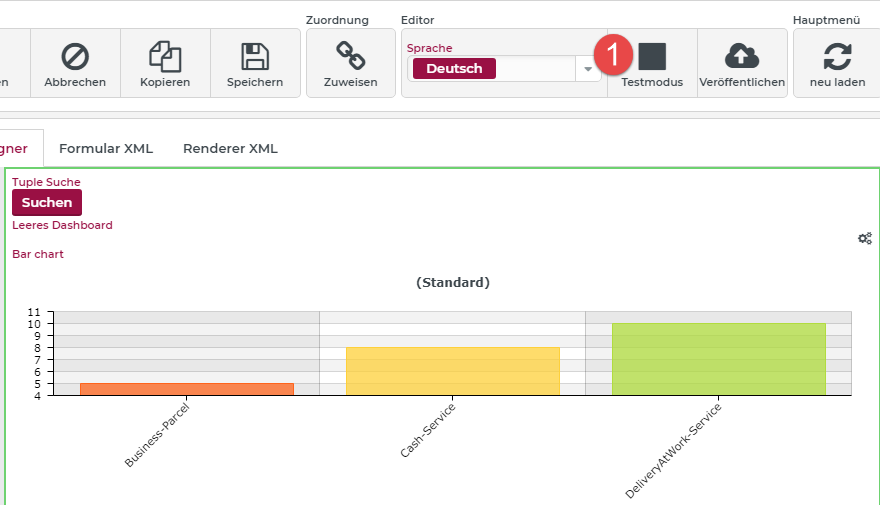
If the user switches to the Test mode (1), the result of the search is already displayed in the bar chart element.
Step 4: Customize Label default
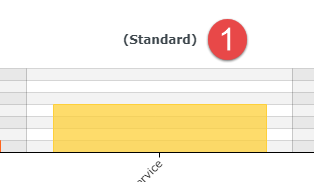
Since no cluster attribute is defined in the OLAP cube of the 'Dashboard configuration', a default value is displayed at (1).
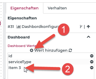
To change this label, you can select the 'Dashboard configuration' element in the form and click (1) in the Properties tab. Now a new dashboard value will be added automatically. Double-click (2) to display the properties of the dashboard value.
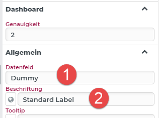
The Data field (1) must be entered. Since there is no corresponding column for this in the data source, the value does not matter, so you can also enter 'Dummy'.
The Label (2) is used only for display in the configurations of the 'Dashboard configuration'.
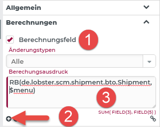
In our example, an entry from localization is to be used for display. For this purpose, the dashboard value (default label) is marked as the Calculation field (1). By clicking on (2), the 'RB' (Resource Bundle) function can be inserted.
Here the resource bundle 'de.lobster.scm.shipment.bto.Shipment' and the resource name '$menu' (3) is used to refer to the already existing entry in localization.
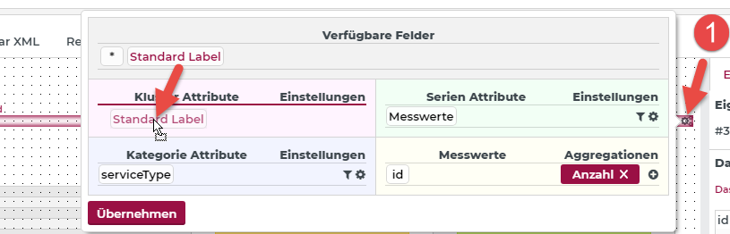
Now open the configuration of the 'Dashboard configuration' element (1) and set the new dashboard value as a cluster attribute by drag & drop.
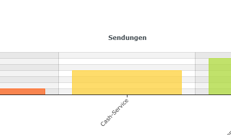
In test mode, the localized value is now displayed instead of the default label.
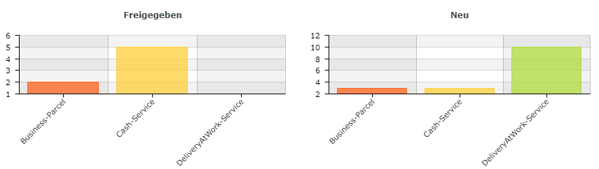
3 dimensional OLAP cube with tuple search
For this example, it is assumed that there are multiple shipments with different service types and work statuses.
The aim is to display the number of shipments for each service type per work status in a bar chart.
Desired result:
For simplicity, the previous example: 2 dimensional OLAP cube with tuple search can be extended.
Step 1: Extend tuple search
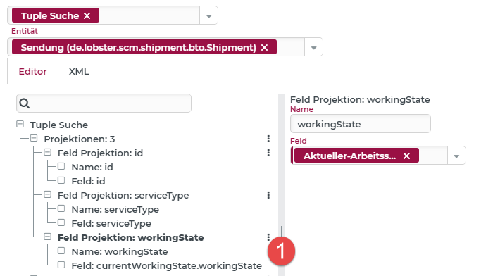
To trigger the working state of the shipments, a new 'Field projection' (1) named 'workingState' is added.
Step 2: Extend Dashboard Configuration
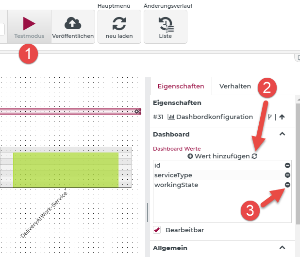
If you switch to Test mode (1) and run the search, the list of available dashboard values is automatically updated by clicking (2). Any self-defined values already present from the above example can be removed by clicking on (3).
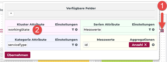
Clicking on (1), the configuration of the OLAP cube can be adjusted in the 'Dashboard configuration' element. Here, the value 'workingState' (2) is now to be used as cluster attribute.
If you then switch to the test mode, the desired result is displayed.
The bar chart element does not need to be customized, as it automatically displays multiple charts (per work status) via the cluster attribute.